This website is made possible by readers. I may earn a small commission when you buy through the links in this article at no extra cost to you. Learn more.
I introduce a lot of minimalist backpacks and apparel, many of which are riding on this trend of products with a minimalist aesthetic. What about a set of minimalist black playing cards? How minimalist can playing cards get? Well, you're about to find out.
Details
- Price $10 on Amazon
- Dimensions 3.5″ (w) x 2.5″ (h) x 0,75″ (d) / 65 (w) x 90 (h) x 20 (d) mm
Overview
Just a deck of minimalist black playing cards.
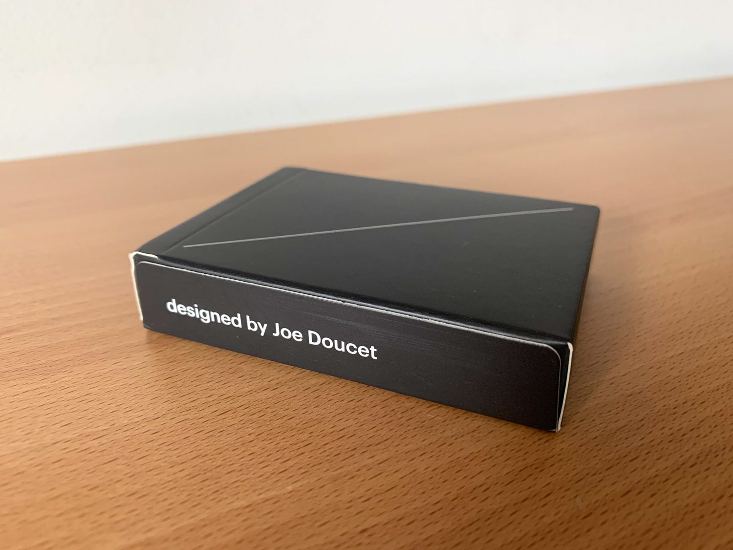
Jou Doucet is not just a talented designer, he is an extraordinary one. As a designer myself, he is in a whole different playing field. From denim jeans to sake bottles, this guy has designed some beautiful stuff. His minimalist design sensibilities are something I can relate to and you can tell that he takes many cues from your favorite designer's favorite designer, Dieter Rams and his Ten Principles of Design.
So one day, Joe was invited to a friend's poker night and looking at the cards, he started wondering about the amount of useless information that is on a contemporary deck of playing cards. For example:
- How many times do you count the ten spades laid out in the center of the card vs just reading the number 10 and the spade in the upper left-hand corner?
- Why do cards have an orientation at all when all of the pertinent information is contained in a small portion of the cards visible when fanned out?
- What's with the Medieval reference to a royal hierarchy
As any passionate designer would do, he started thinking of ways to minimize the playing cards to the absolute minimum.
Style
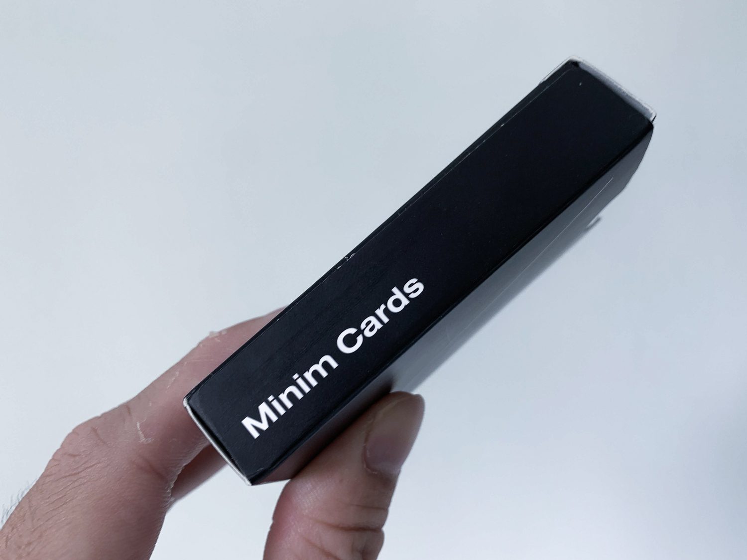
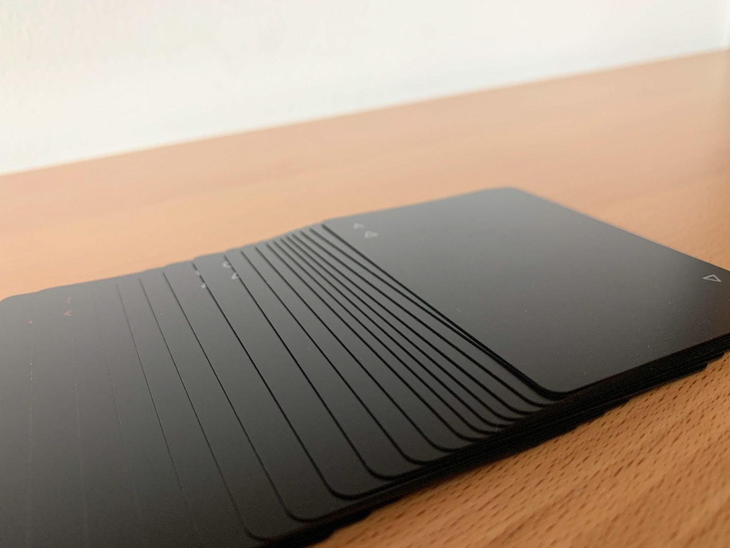
The Minim Cards come in two colors, white or black. As always, the black version is the one I'll be reviewing for this article. Taking the cards out of the box, you can already tell how minimal they are.
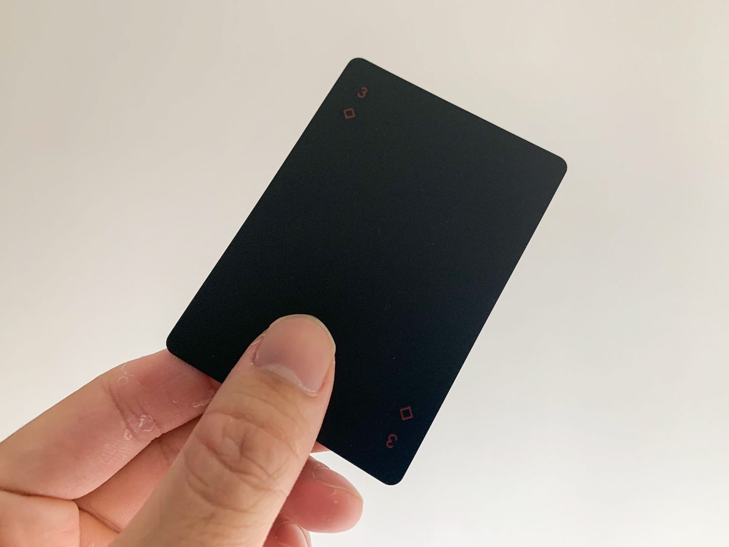
Joe's idea is that all the information you need on each card is the number and the suit on the upper left-hand side of the card. So, that's literally the final design.
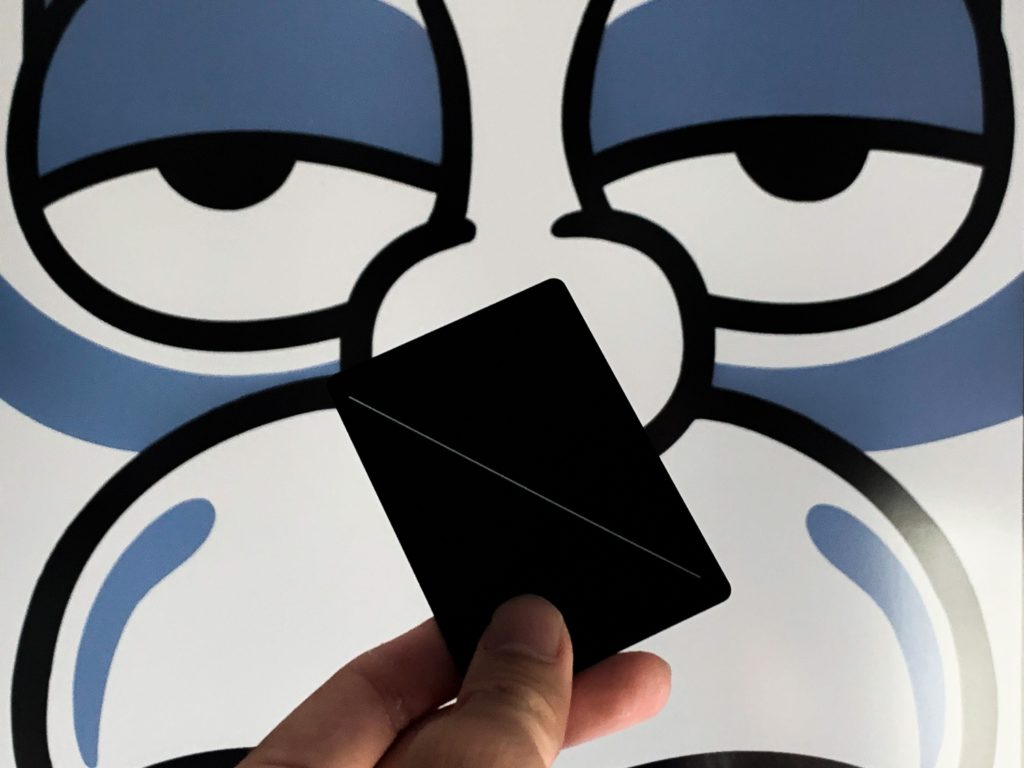
A totally black card with the number and suit on the upper and lower right card. All decorative elements, such as the illustration of a king with the sword through his head have been mercilessly taken out.
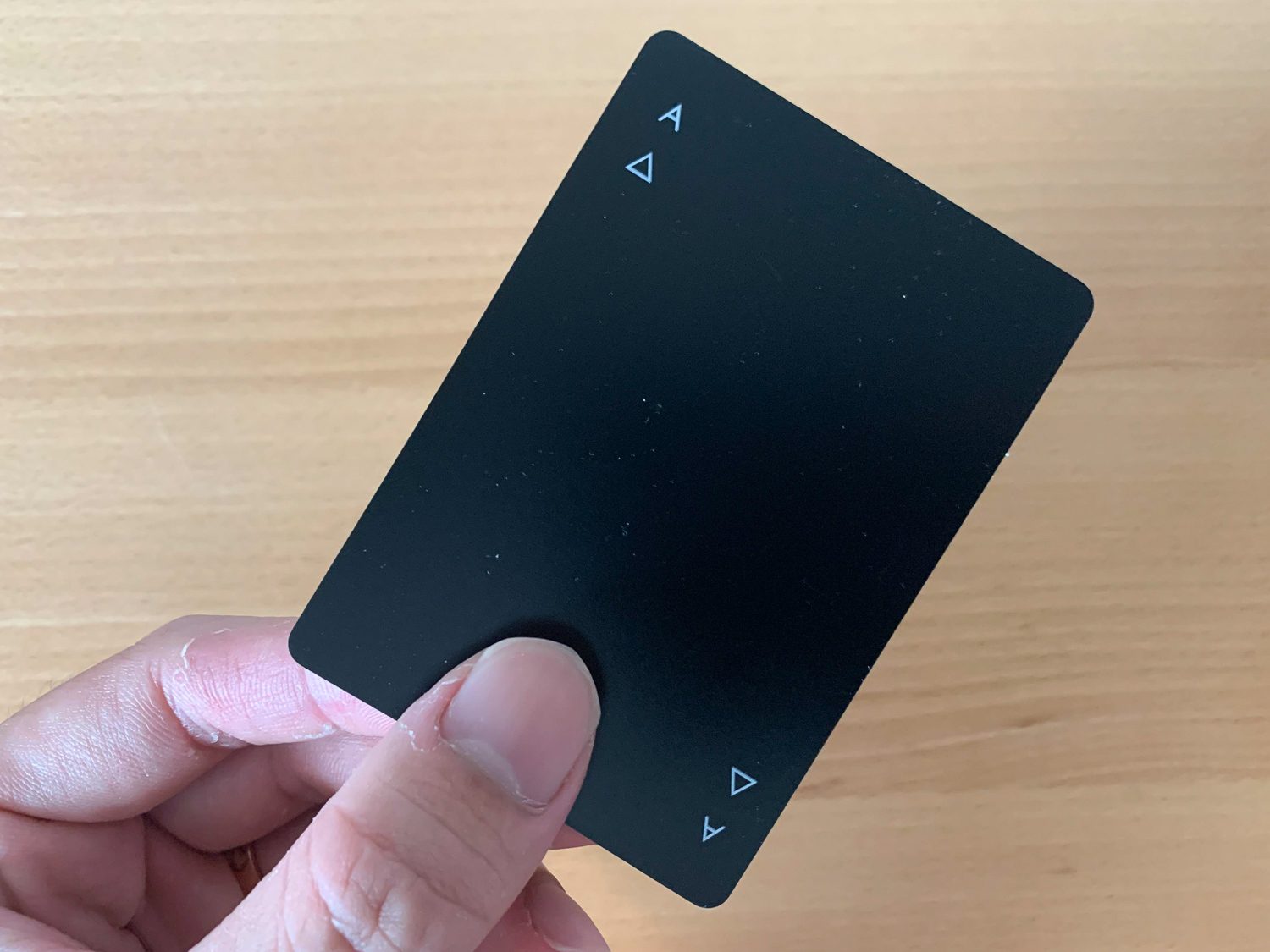
The numbers are 2-10, J, Q, K, A and JK for Joker. The suits were also redesigned and reduced to use geometric shapes. The spades are represented by an equilateral triangle, hearts, by an inverted triangle, clubs by three circles. The diamonds are the only ones spared, retaining the shape of an actual diamond. While there is a clear reference to the traditional symbols, they have been heavily reduced to keep in line with the design direction.
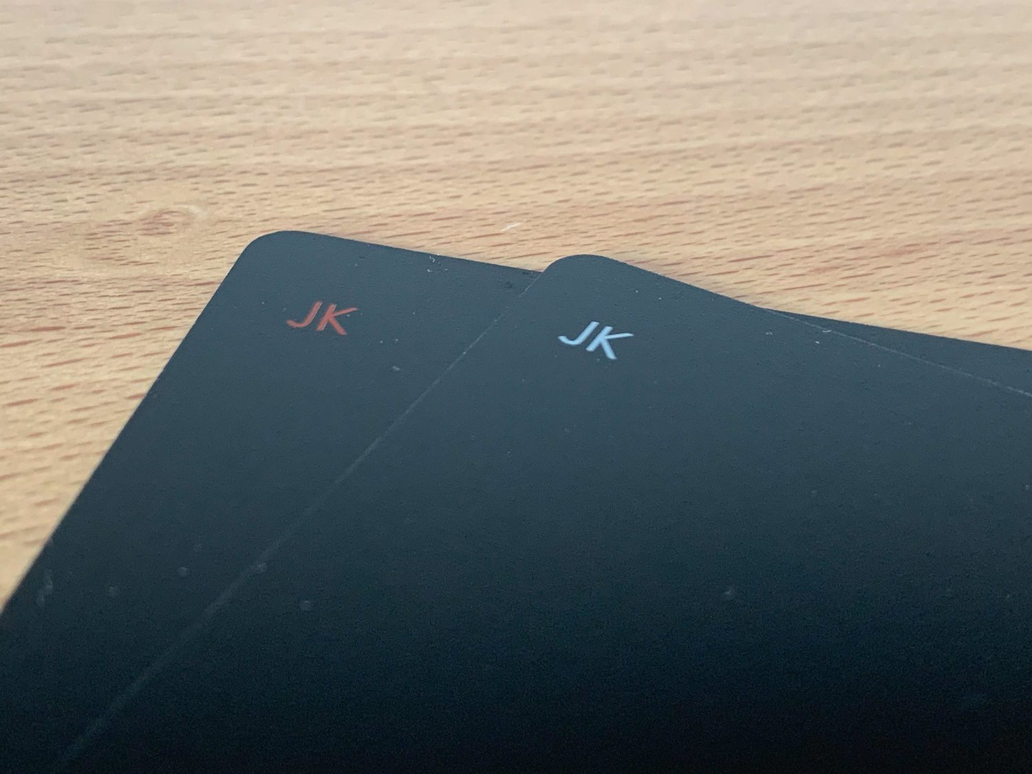
While the information has been stripped down to the bare minimum, he did leave the differentiation of color in, by having the symbols in white for spades and clubs and red for hearts and diamonds. The two Jokers in the deck are also in two different colors.
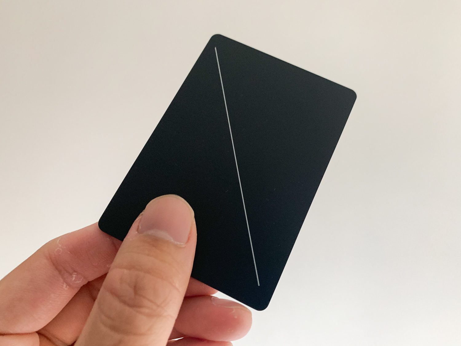
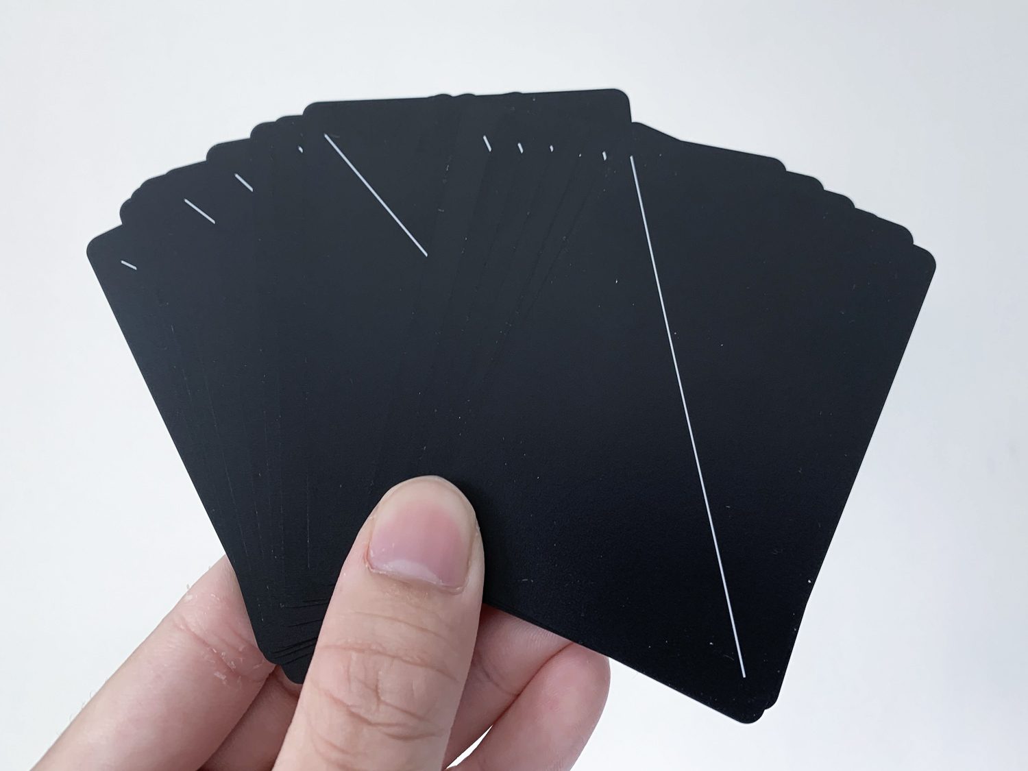
Last but not least, Joe did see the importance of being able to distinguish the front and back of the card easily, so you don't accidentally reveal your hand to an opponent. What he did was simply include a single diagonal line from the upper left to lower right so you can tell it's the back of the card regardless of how you hold them.
This used to be an ad.
But no one likes ads, so I got rid of them. If my articles helped you, I ask for your support so I can continue to provide unbiased reviews and recommendations. Every cent donated through Patreon will go into improving the quality of this site.
A nice little detail, which I'm not sure if it was intentional or not, is that the front of each card has a slight sheen on them, so looking at a pile of cards, you would be able to intuitively tell the odd one facing the wrong way.
The style is so minimalist that it'll, ironically, to draw attention. Taking out the cards to play drinking games in a new hostel, you'll bound to get some comments, hopefully compliments, about them.
Material
Professional-grade black playing cards.
There are actually three types of materials commonly used in playing cards, and they are paper, vinyl, and plastic.
Paper is the cheapest and obviously, the least durable. Corners will fold with use and you'll find yourself replacing them often. Vinyl cards are the middle tier choice, providing a balance between cost and quality.
The Minim Cards uses plastic, specifically PVC, which is the material almost all casinos use and is the most durable and highest quality compared to the other materials. The playing cards I usually use, a pack of Bicycle Guardians Playing Cards, also uses plastic and the quality is top-notch.
Usage
That's the thing with designing minimal products. It's walking the tight rope between form and function.
As you can expect, these minimalist black playing cards take some getting used to. With regular cards, you can immediately tell the difference between cards without really reading them. Like a larger card would have more print than a smaller card. Or the difference between a picture card (that's what my friends and I call Jacks, Queens, King, Aces anyway) and a number card.
The symbols printed in white aren't so bad, but the ones in red sorta blends with the black, which makes it hard to tell at a glance. I imagine playing drunken strip poker in a dark room being a challenge.
I designed a thing.

I found a 100 year old company that would create these heirloom quality canisters for me. They are handmade and will keep your tea leaves, coffee beans or anything that you need dry for years to come.
or read review
You know sometimes when you finish a round of Blackjack and everyone just throws their cards in the middle for the dealer to collect. Because the cards are in a pile, it might be hard to tell at a glance since all the black just visually merges together.
These black playing cards are also really smooth, like cream cheese on your bagel. Like if you just put it down onto each other, they'll slide a little. Just by dropping the card onto a surface from a little height, they would slide onto each other and I've had them slide all over the flow a few times now. With that said, the smoothness gives it an amazing hand feel and they feel super nice in your hands.
As the cards are black on the front and back, you'll notice that dust that gathers on the cards are easily noticeable, as with most other all-black products.
Once again, the Minim Cards are a perfectly useable pack of cards, but if you are comparing it to contemporary playing cards, you definitely feel some loss in functionality, specifically distinguishing between cards easily.
Conclusion
These are the most beautiful black playing cards you can get right now.
As an aspiring minimalist and designer, I definitely have more tolerance for form over function. I see the Minim Cards, really, as a statement piece of accessory and a talking point when you whip them out for a round of drinking games.
They are absolutely beautiful and I bring these minimalist black playing cards whenever I travel. You'll never know when they can help you socialize easier in a new environment.
Like this review? See all of my in-depth reviews.
Also, consider supporting me by being a Patreon. Every cent given will go back into improving the content of this website.
Tagged accessory areaware joe doucet minimalist playing cards review